Internet users have been duped for the last time.
No, they’re probably not going to download your ebook, because the last time they claimed one they regretted it. They traded their name, phone number, and email address for a two-page document filled with useless content.
Now they’re being bombarded with promotional messages from businesses they’ve never heard of. Their spam filter has never been tested so fiercely, and their voicemail is full of messages from robots.
If you’re reading this, it’s already too late. The value of your offer has plummeted because the marketers before you forgot that providing worthwhile content is more important than generating a lead.
The odds are against you, but it’s not impossible to convince your prospects to download your ebook.
To do it, you’ll need a special tool used by expert marketers, along with knowledge of a few psychological tricks, copywriting hacks, and web design best practices.
(If at any point you see a term you don’t understand, you can find it here in the Instapage marketing dictionary.)
The tool that’s going to get your ebook downloaded
Most web pages are designed to inform. Think an “About” page or a blog post. They aim to, first and foremost, convey knowledge to a visitor.
But digital marketers don’t always want to inform. As prospects creep further down a business’s marketing funnel, it becomes necessary to persuade. And web pages designed to inform aren’t great persuaders.
This is where landing pages come into play. A landing page is a web page, disconnected from a website’s main navigation, that’s designed strictly to convince visitors to take action. That action could be to sign up, subscribe, download, buy, etc.
This is the page you’re going to want to offer your ebook on.
How to build a persuasive ebook landing page
Building a landing page that gets your ebook downloaded starts with web design best practices and ends with lessons in human behavior. Here’s how to begin constructing yours…
1. Remove your navigation menu and your footer
The navigation menu at the top of your website and the footer at the bottom allow visitors to jump from page to page. Normally, it’s helpful to them, and to you. People get to learn more about you, and you get to continually provide them with content in the hopes they decide to do business with you.
But on a landing page, they're more harmful to your goal than they are helpful. On these pages, it’s necessary to keep your visitors focused on one thing: converting. Any other link to any other page, including ones in your images and text, are distractions.
Take a look at this landing page from The Nerdery:

See the “Who We Are,” “What We Do,” and “Our Work” in the navigation? A whopping 84% of landing pages have links like those at the top of them. And those links have the potential to ruin your conversion rate. HubSpot found that out years ago.
Here’s what your landing page’s navigation should look like:

See it up there at the top of the page? No?
That’s because it’s not there.
All the outbound links in your navigation, your logo, and your copy should be removed from your page, and there should only be two ways off it. The first is by clicking the “X” in the upper right corner of your visitors’ web browser, and the second is by hitting your call-to-action button.
2. Learn how to talk the talk
Think back to everything you learned in school about writing: how to form complete sentences, when to use a semicolon, and the fancy vocabulary that impressed all your teachers.
Got it? Okay, good.
Now forget it all.
Academic language isn’t what’s going to get your visitors excited to download your ebook. They want to have a conversation with you. They want to feel something.
Speak to them through writing as you would a friend. Use your words to paint a picture in their mind of a better life, achievable with the help of your ebook.
Here’s a great example from AWAI:

What’s this landing page advertising? The headline says “Copywriting Program,” but that’s not it. Look closer…
“I understand that businesses of ALL shapes and sizes need this kind of writing.”
“Many are more than willing to pay top dollar.”
“Once I master the principles of copywriting, I can take charge of my financial destiny.”
It’s not a course they’re selling, but a lifestyle — one of financial freedom and comfort.
After your visitors read your ebook, how will their lives be improved? How will your content transform them?
Let them know by stressing the benefits of your offer over its features. Don’t say “This ebook features quotes from marketing experts.” Instead, try “Learn from marketing experts how to build a sales funnel that generates maximum revenue.”
If you can get specific, even better. “Learn directly from Fortune 500 marketers how to build the sales funnel we used to generate $5,000 in monthly revenue.” Be as descriptive as possible, but as brief as possible. Make one word do the work of two.
Remember, your visitors aren’t on your landing page to read for pleasure. They’re there because your advertisement, or Tweet, or email, piqued their interest. They want to determine the value of your offer, and quickly.
That means it’s not only important to be brief, but to create what’s called a “ visual hierarchy” on your page. When constructed the right way, a visual hierarchy is what will allow visitors to skim your content without missing all the biggest takeaways.
Take a look at this DigitalMarketer landing page:

What do you notice?
If you’re like most people, you’ll probably see the image or the headline at the top of the page first. Then, you’ll read the subheadline “‘Copy & Paste’ these 72 PROVEN headline formulas to get more clicks from Facebook, Twitter and your own blog…”
Then, your eyes will move to the bullet-pointed copy. You’ll read the bold words like “41 examples you can copy and paste,” and “optimize any headline.” You can read the rest of the text on the page, but you don’t have to in order to understand what you gain by downloading this offer.
This is the kind of visual hierarchy you want to form on your own page. Start with a big, bold, benefit-oriented headline and subheadline combination. On this page, it’s “get more clicks from Facebook, Twitter, and your own blog.”
Below that include bullet points or small chunks of copy that are easy for visitors to scan quickly, and bold the most important words in them. By “important,” we mean the words that highlight the benefits of claiming your offer.
The best example of that on this page is the bolded phrase “optimize any headline.” The other bolded phrases are features, not benefits. Rephrased to highlight thebenefit of those features, they might look something like this:
- Instantly boost your authority with 13 ‘piggy-back’ headlines you can use to align your business with well-known brands.
- Convince any audience to click with 18 ‘threatening’ headlines you can deploy in whichever market you choose.
- Create powerful headlines without touching a key using 41 examples you can “copy and paste.”
- Optimize any headline in 12 seconds or less with 3 simple hacks.
Now when readers quickly scan the page, they’ll know immediately why they should download the offer instead of just what’s inside.
Make sure the “why” is clear on your landing page too, especially in your call-to-action button. This is the button your visitors are going to press to claim your ebook. Would “Download” compel you to download?
Probably not. Instead, (we know, this is getting repetitive) use a phrase that emphasizes the benefits of downloading.
If we were to rewrite this DigitalMarketer call-to-action, we might try something like “Boost My Traffic,” or “Show Me The Secret To More Clicks.” There’s a good chance it performs better than “Download.”
3. Leverage insights into human behavior
When you’re trying to convince an audience to do something, it’s important you know how they think. No matter who they are, or what kind of ebook you’re offering, the following hold true:
-
Your visitors take cues from other buyers
When evaluating a product, a service, or even an ebook, people tend to read reviews to determine whether or not the offer is worthwhile. Including testimonials from satisfied customers on your landing page will make your visitors more comfortable with claiming your content.
A shocking 88% of people trust online reviews as much as a personal recommendation. If other people have found your content valuable, then chances are your visitors will too.
-
Name-dropping works
In everyday life, people call name-droppers “shameless.” In digital marketing, though, name-droppers generate conversions.
If you partnered with a well-known brand or author to create your ebook, or included insights from industry influencers, let visitors know.
If they see a reputable name they recognize on your landing page, by association your business instantly becomes more trustworthy. Use logos and photos to showcase your big-name partners.
-
Everybody loves free stuff
If you’re not selling your ebook, it’s free. Yes, technically you’re asking for personal information in exchange for a copy, but because you’re not charging anything monetary, you can strengthen your landing page by labeling your ebook with the second-most persuasive word in copywriting: “Free.”
-
A person’s name, to them, is the sweetest and most important sound in any language
But, when you don’t know their name, the word “you” takes a close second. Remember, you’re not writing — you’re speaking to the reader through the text. So address them as you would in person.
This blog post contains more than 100 mentions of the word “you.” Do you feel like you’re reading, or having a conversation with a friend?
-
Fear of missing out is real
There’s a reason we scramble to purchase offers that are only available for a limited time, and buy things there are only a finite number of.
We’re terrified of missing out on something that could change our lives.
Use phrases like “available until...,” “limited-time offer,” or “only (x number) of copies available” to pressure your visitors into converting. But only do it if your offer really is available for a limited time.
Don’t make the mistake of thinking your visitors are stupid. If they navigate back to your landing page after the offer’s deadline, and it’s still available, you’re going to lose their trust.
4. Use images to boost trust
This is where most ebook landing page creators screw up. They know that images can be powerful conversion boosters on landing pages, so they include a professional-looking graphic of their ebook’s front cover.
Any idea why that’s a bad plan?
I don’t know about you, but personally, I’ve downloaded plenty of ebooks that looked good on the outside and read poorly on the inside.
It’s not a pretty cover your visitors are concerned about. They're worried about handing over their name, phone number, email, and company name, then opening up your ebook to find it filled with worthless information. So how do you assure them what they’re downloading is valuable?
Give them a preview of your ebook. Showcase just one page that features stellar content like descriptive infographics, industry research, and expert advice, the way Relevance does on this landing page:
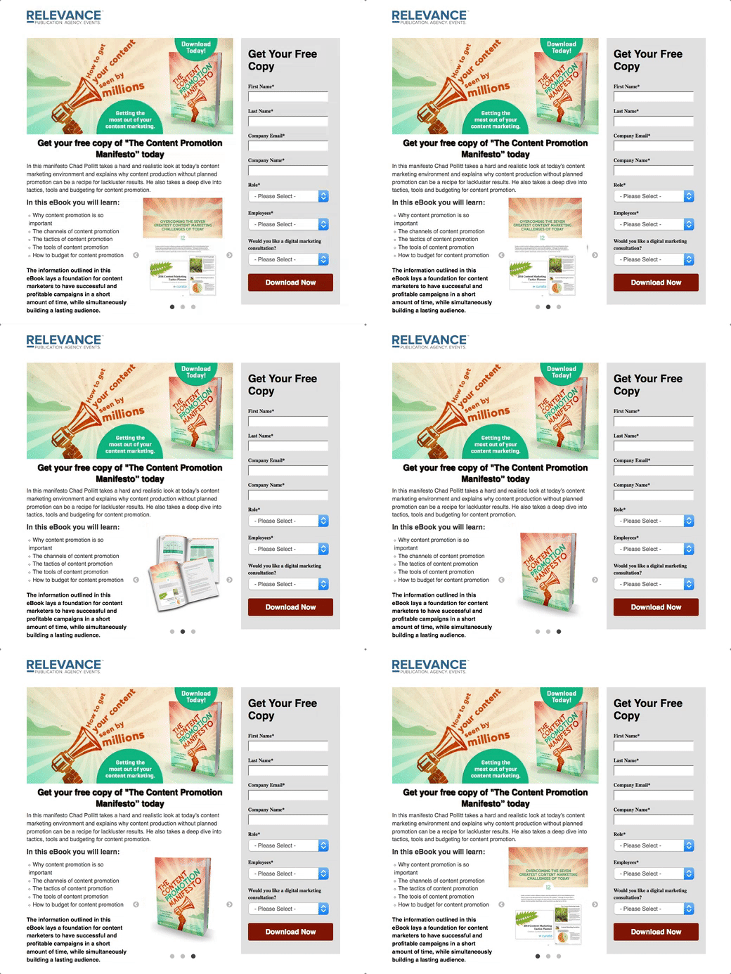
Then, let your visitors know that there’s plenty more where that came from.
How will you design your ebook landing page?
Have you found success with ebooks? What techniques have you found most effective on your ebook landing pages?
Let us know in the comments! Then, find out how to get more from your marketing campaigns with SEMrush.